Data visualization
Univariate Plots(visualization at each attribute)
- Histograms
- Density Plots
- Box and Whisker Plots
Histograms group data into bins and gives the count of observations in each bin. We can get an insight whether an attribute is Gaussian, skewed or has any exponential distribution.
Density plot is another way of getting a quick idea of the distribution of each attribute
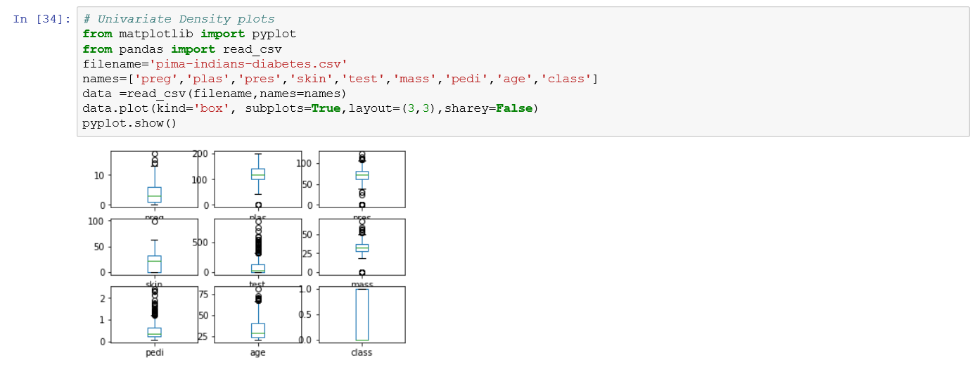
We can also review the distribution using Box and Whisker Plots. Box plots summarize the distribution of each attribute, drawing a line for median and a box around 25th and 75th percentiles.
The green line indicates the median or middle value. The whiskers give an idea of idea of the spread of the data and dots outside the whiskers shows the outlier values.
Multivariate Plots(interactions between multiple variables)
- Correlation matrix Plot
- Scatter Plot matrix
Correlation gives an indication of how related the changes are between two variables.
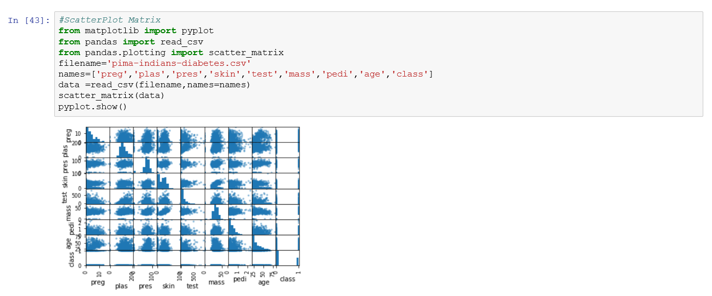
A Scatter plot shows the relationship between two variables as dots in two dimensions, one axis for each attribute.


Comments
Post a Comment